| |
|
The walkthrough
|
| |
|
Install: Pick the right add-in for your stack (or install both)
|
| |

|
| |
|
Before anything else, pick a side. The wrong choice costs you 10 minutes a day in friction.
|
| |
|
If your team lives in Microsoft 365, install Claude for Microsoft 365 first. The cross-app context (Excel to Word to PowerPoint) is the differentiator. ChatGPT works fine in Excel, but it doesn't see your Word doc in the next tab.
|
| |
|
If your team lives in Google Workspace, install ChatGPT for Google Sheets. Claude for Microsoft 365 doesn't work in Google Sheets, full stop.
|
| |
|
If you straddle both, install both. They don't conflict.
|
| |
|
Pro tip: Install via your IT admin's marketplace, not the public store. The admin version preserves your data residency and audit logging. The public version pings to vendor defaults, which security will eventually find and shut down.
|
|
| |
|
|
| |
|
Usecase 1: Hand it real data, ask the question, not the formula
|
| |
|
| |
|
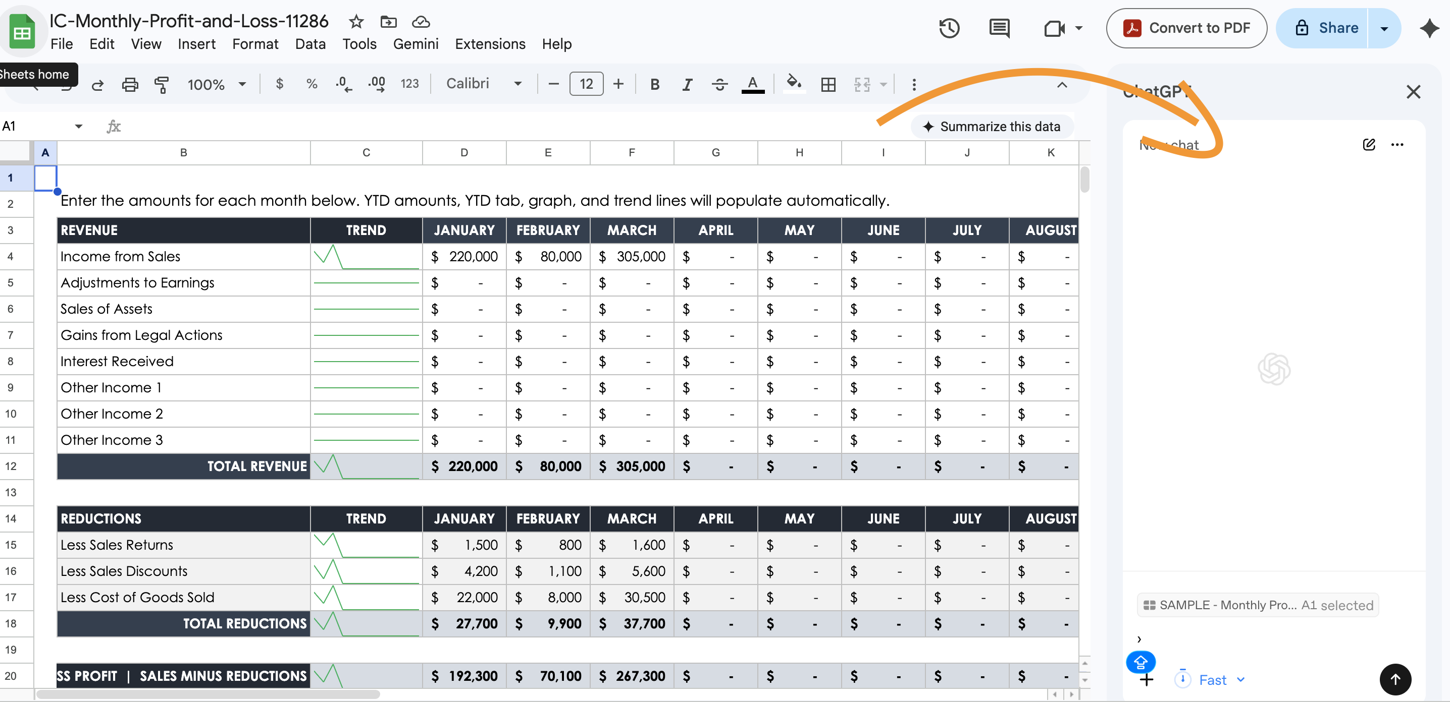
The single biggest unlock is changing what you ask for. Every spreadsheet tutorial for the last 20 years taught you to translate your business question into a formula. The new model inverts that.
|
| |
|
Old way: I want to find the average deal size for enterprise customers who closed in Q4. So I write =AVERAGEIFS(deal_size_column, segment_column, "Enterprise", close_quarter_column, "Q4"). Then I debug it. Then I copy it down. Then I realize my segment column has a trailing space.
|
| |
|
New way: Open the sidebar. Type:
|
| |
|
What's the average deal size for enterprise customers who closed in Q4? Show me the formula you used and any data quality issues you noticed.
|
|
| |
|
It writes the formula, runs it, returns the answer, and flags the trailing whitespace I would have missed. 90 seconds. The shift is from "I need to know how to do this" to "I need to know what I want."
|
| |
|
Watch out: Both assistants will confidently produce a wrong formula if your column headers are ambiguous. Always ask "show me the formula and explain the approach" instead of "give me the answer."
|
|
| |
|
|
| |
|
Usecase 2: Build a financial model from a brief
|
| |
|
| |
|
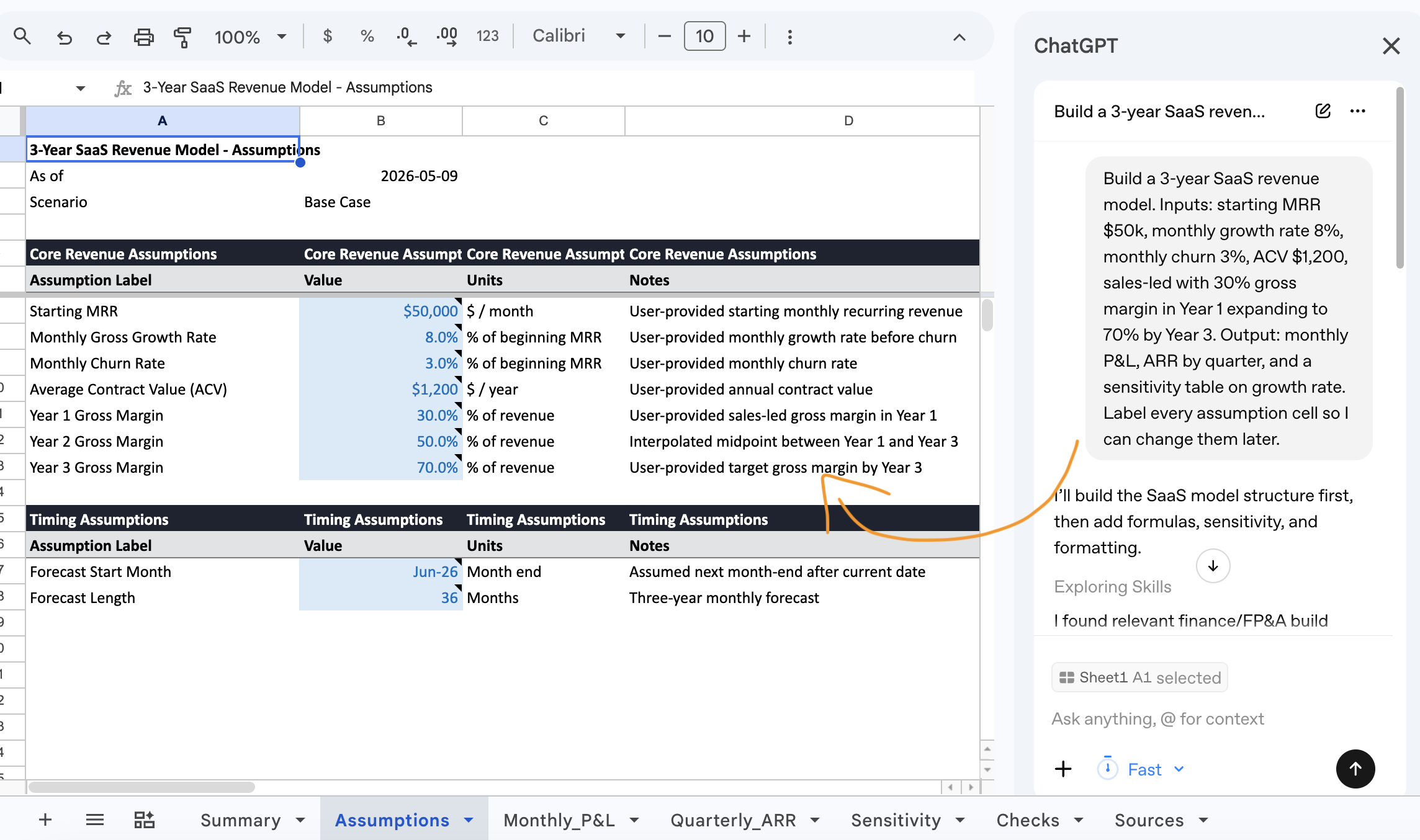
This is the part that genuinely surprised me. I gave Claude in Excel this brief, attached to a blank workbook:
|
| |
|
Build a 3-year SaaS revenue model. Inputs: starting MRR $50k, monthly growth rate 8%, monthly churn 3%, ACV $1,200, sales-led with 30% gross margin in Year 1 expanding to 70% by Year 3. Output: monthly P&L, ARR by quarter, and a sensitivity table on growth rate. Label every assumption cell so I can change them later.
|
|
| |
|
It built the model in roughly 4 minutes. Every assumption cell highlighted in blue, formulas cleanly written, no hardcoded numbers in the calculated rows. Not perfect: the sensitivity table needed wider columns, and the gross margin curve was linear where I'd have done it stepped. But the bones were right, and 90% of the labor was done.
|
| |
|
Pro tip: Always give the brief in this shape: "Inputs: ... Output: ... Assumptions to label: ... Conventions to follow: ..." Most people skip the conventions line. Tell it to highlight assumption cells, freeze the top row, format currency to thousands.
|
|
| |
|
|
| |
|
Usecase 3: Clean messy data from somewhere else
|
| |
|
| |
|
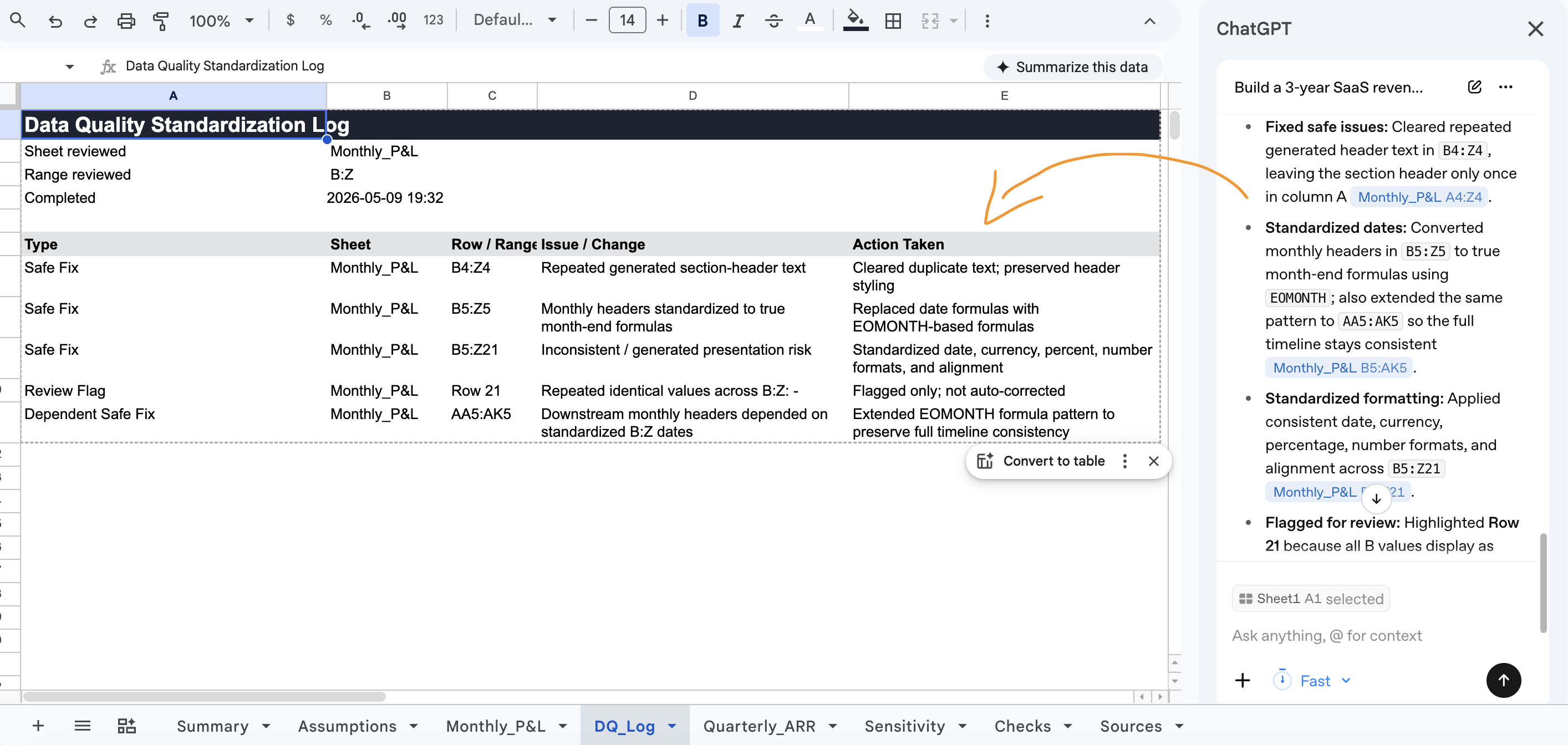
Half my spreadsheet work used to be pasting data from a CRM or survey tool, then spending 20 minutes wrestling it into something usable. Inconsistent caps. Mixed date formats. Random phone formats. Duplicates with trailing whitespace.
|
| |
|
Now I can paste the data, open the sidebar, and type:
|
| |
|
This data came from [source]. Standardize the [columns]. Fix obvious data quality issues. Flag rows that look suspicious so I can review them before you change them. Show me what you did.
|
|
| |
|
It does the boring work. The "flag rows for review" line matters most: the assistant will sometimes make confident calls you'd want to override. A row where someone wrote "n/a" could be missing data or "not applicable." You want that judgment, not theirs.
|
| |
|
|
| |
|
Usecase 4: Generate the chart for the slide deck
|
| |
|
| |
|
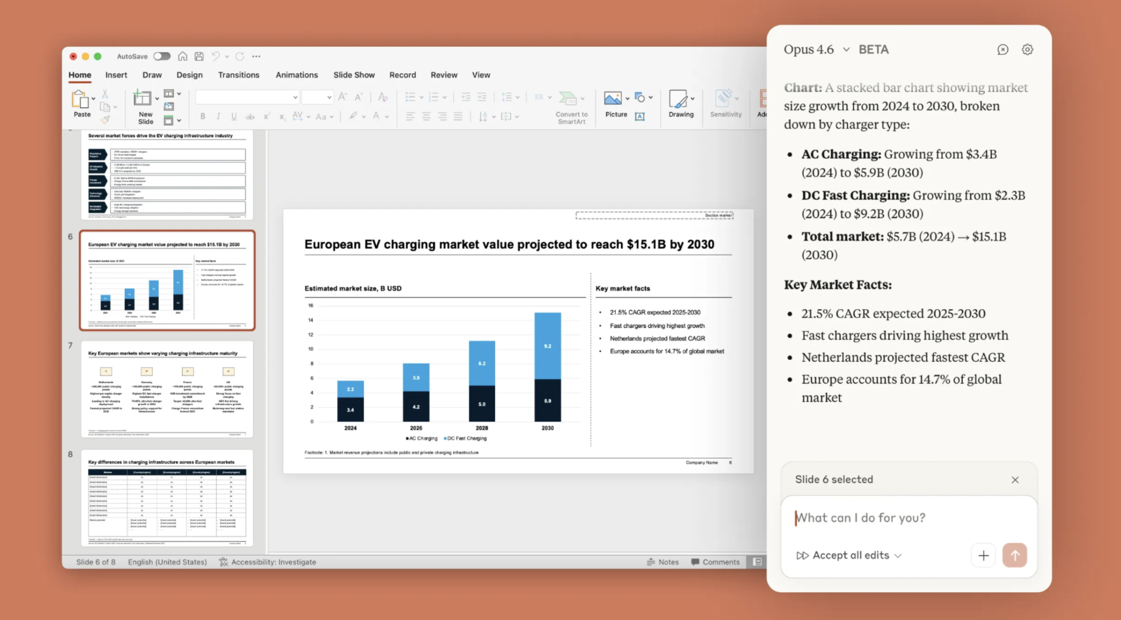
The handoff between Excel and PowerPoint has been broken for 30 years. Screenshot in, fuzzy chart out. Or copy as a linked chart and watch it break the next time someone opens the deck on a different machine.
|
| |
|
With cross-app context, that workflow flattens. Run the analysis in Excel, switch to PowerPoint, and type:
|
| |
|
Build a slide showing the Q4 deal-size analysis from the Excel file we just worked on. Headline finding at the top, supporting chart in the middle, 3-bullet narrative at the bottom. Use the company brand colors.
|
|
| |
|
Claude builds the slide. Native PowerPoint chart, not a screenshot. Bullets pulled from real numbers in the Excel sheet. ChatGPT can do the chart in Sheets and export, but the round-trip to Slides loses fidelity. Claude's Microsoft 365 integration is the only place this handoff works cleanly end to end.
|
| |
|
Pro tip: Save the layout as a custom template after polishing it once. Next time, ask Claude to use it by name. The structure is the asset; the data is what changes.
|
|
| |


